Wittmann
Short facts
client
Wittmann Möbelwerkstätten
category
Corporate Typeface
colloboration
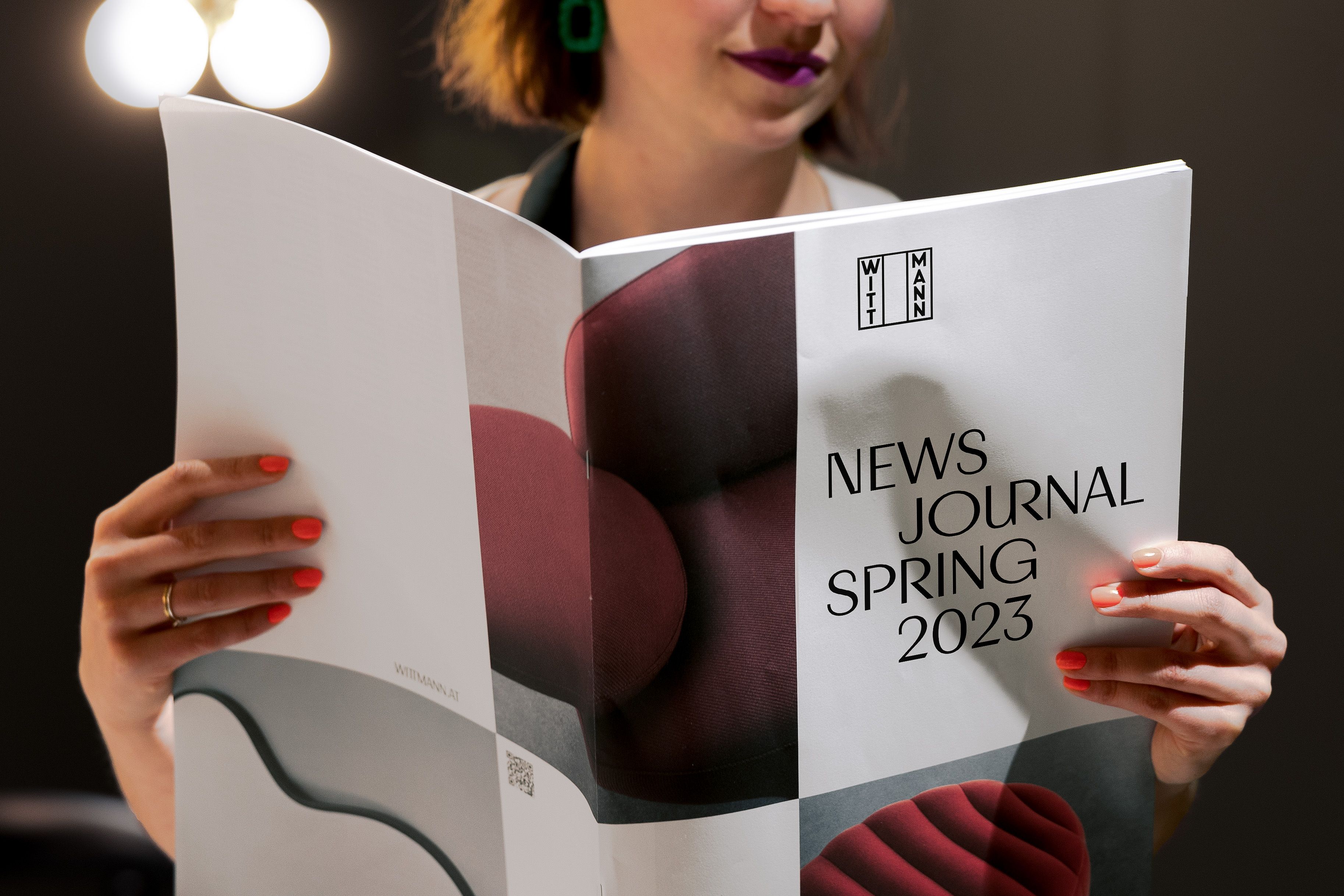
Refresh by Martin et Karczinski
Magazine & Graphics for Salone 2023 by Zaven
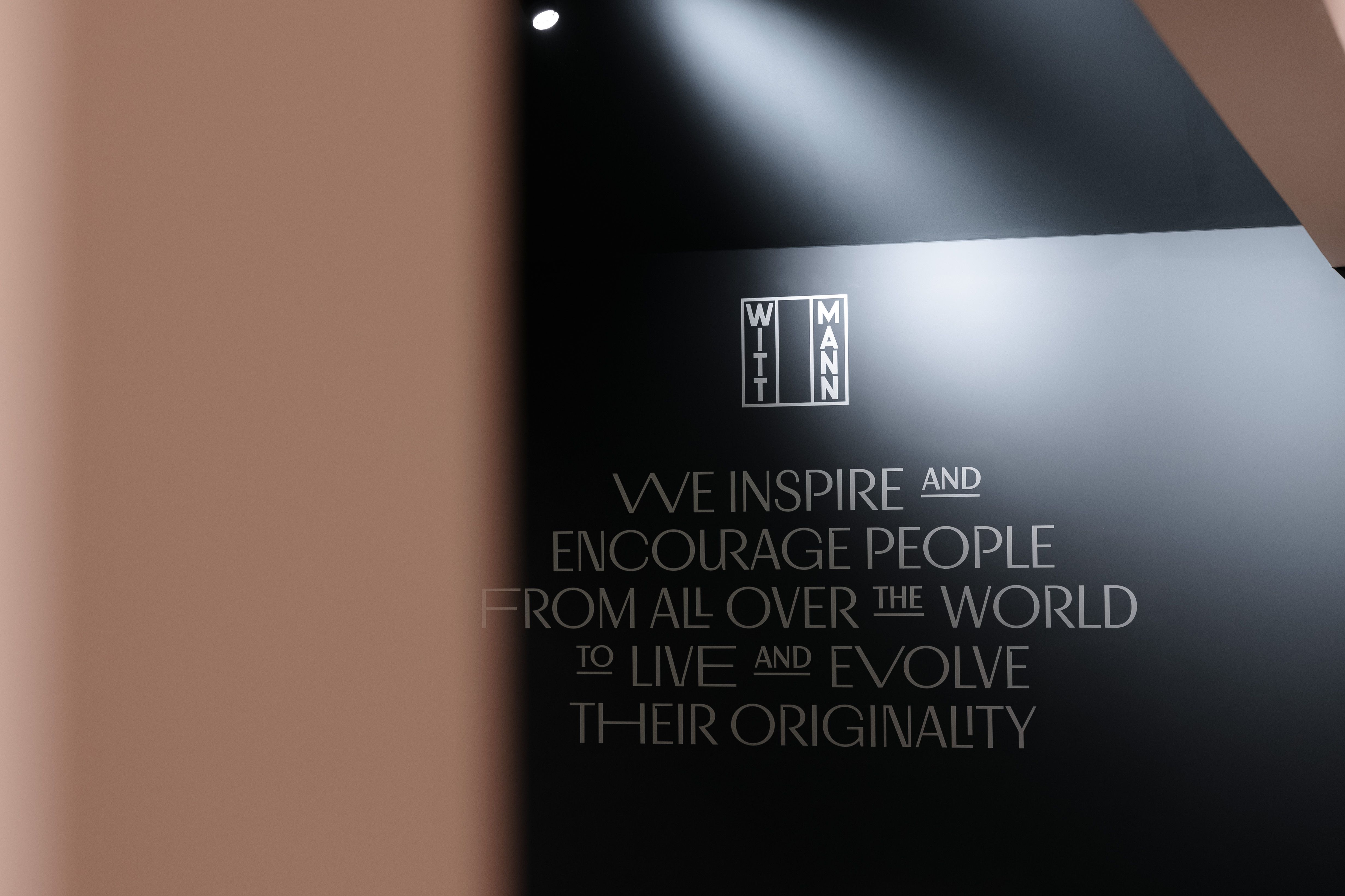
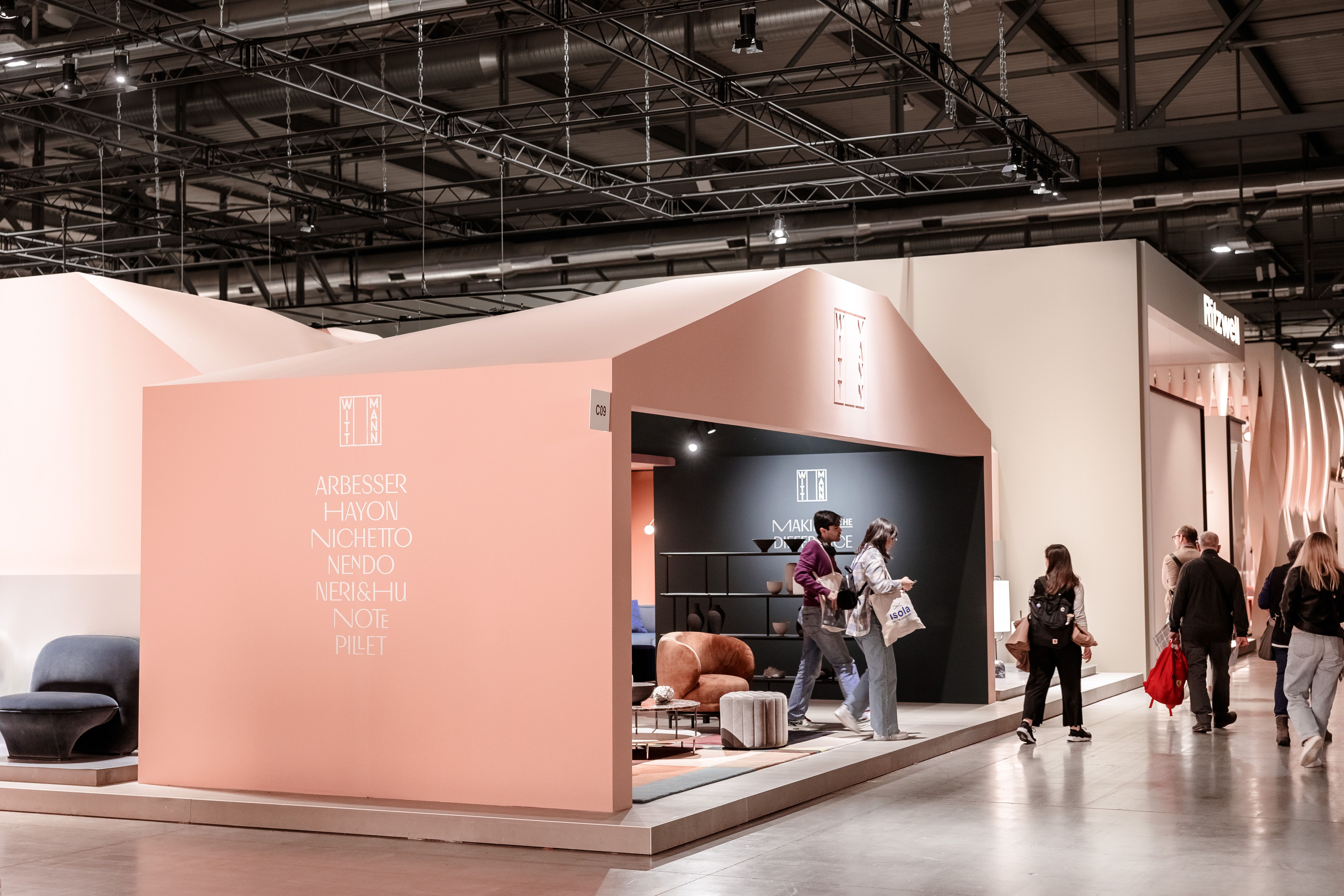
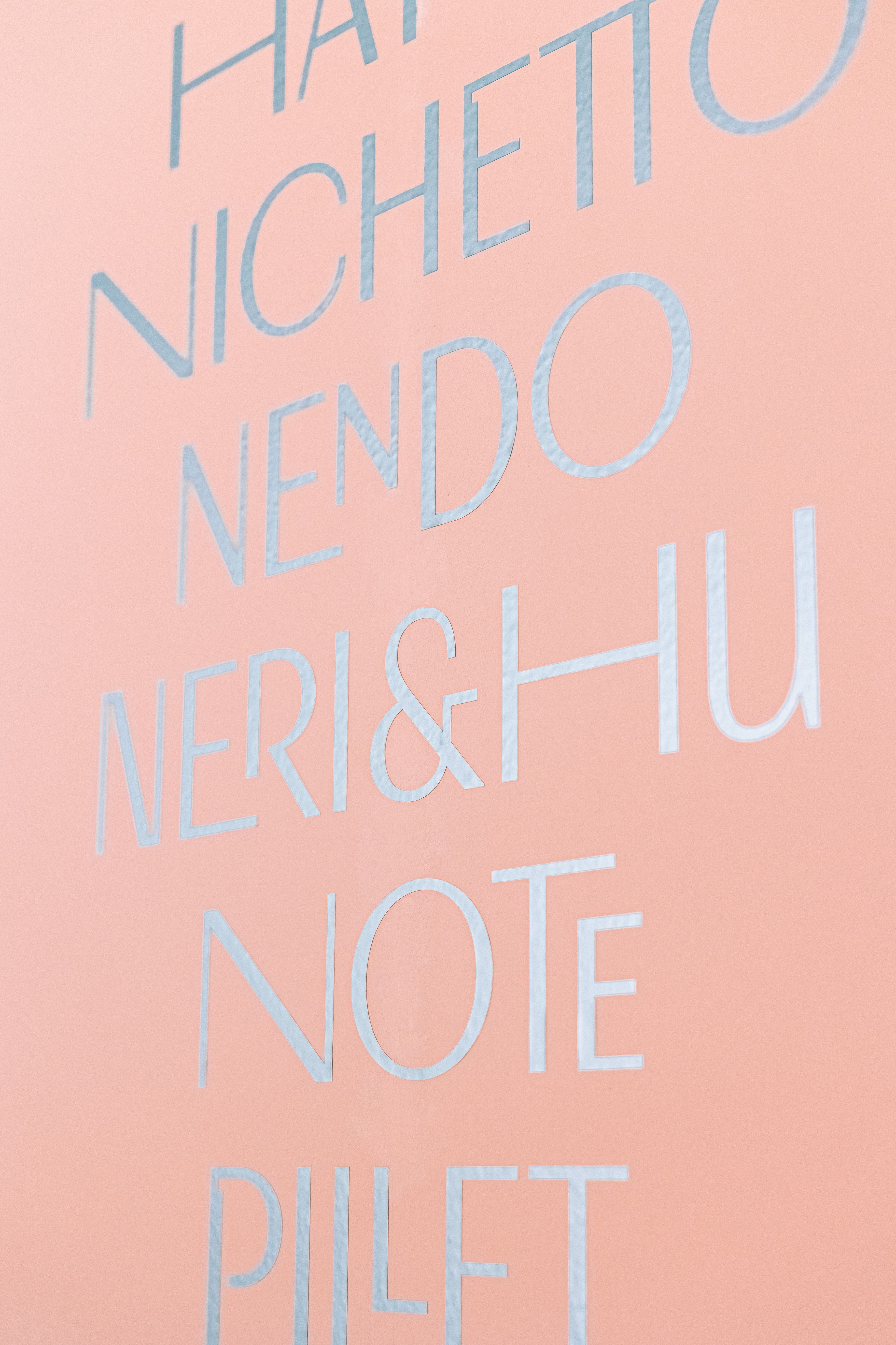
Shows off with big type
Shows off with big type
On the occasion of Salone del Mobile 2022, Martin et Karczinski undertook a brand refresh for Wittmann Möbelwerkstätten. We were tasked with designing one of the most formative components – the new corporate typeface.
Under the motto: »future-driven connection to originality,« we captured the essence of the written graphics from their inception – the birth of the Wiener Werkstätte. Furthermore, we cultivated an independent, elegant, and contemporary sensation that invites use on a large scale.
future-driven connection to originality
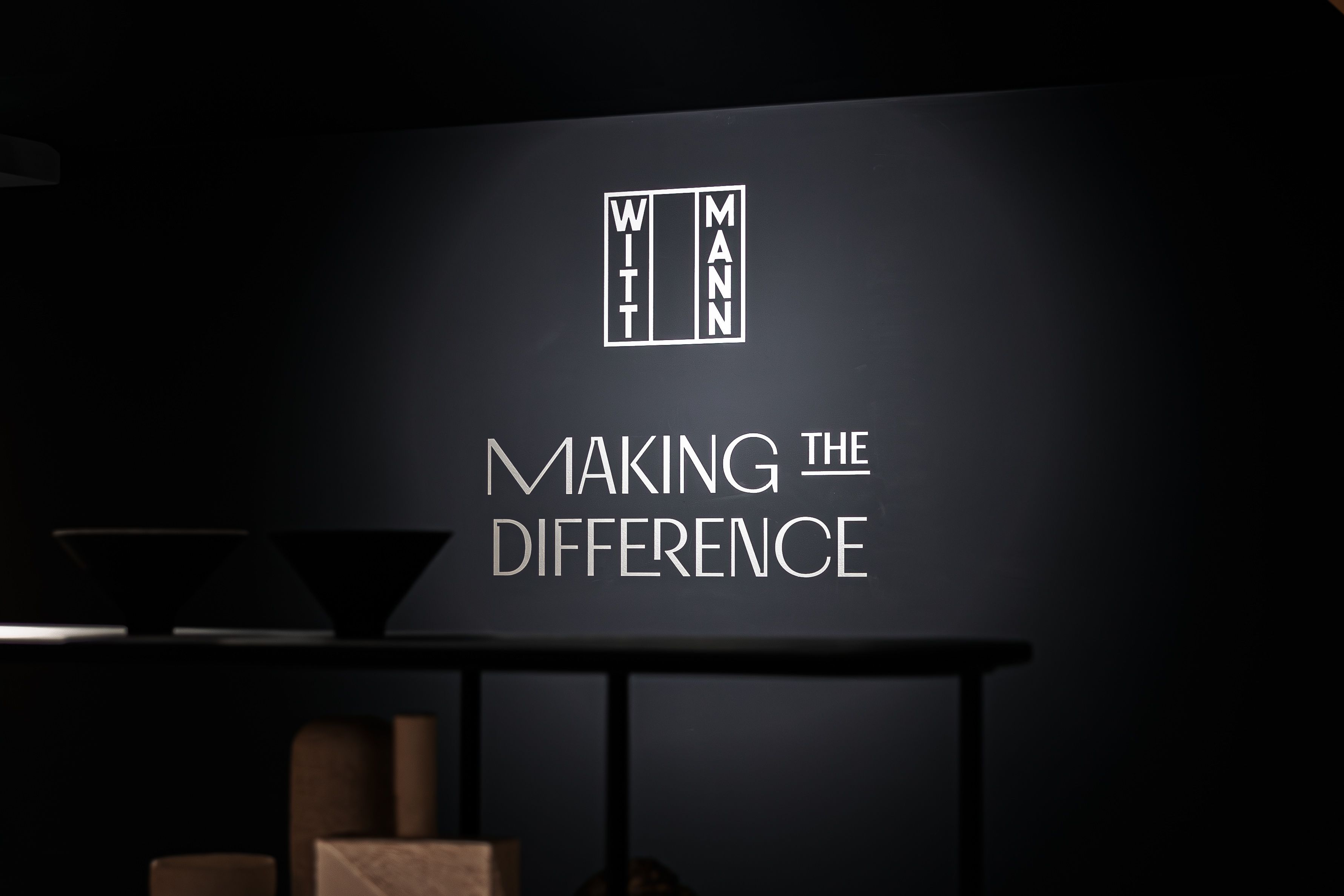
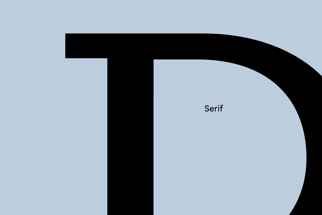
Wittmann’s aspiration was to uncover a distinct and recognizable form idea, one that would establish identification using a single letter. This endeavor led us to pioneer the Reverse Serif, a novel design approach for letter shapes. This principle not only embodies the minimalist nature of a square but also finds resonance in their square-shaped logo, further enhancing Wittmann’s brand identity.

Open-Type features offer a flexible use of alternative letters or ligatures that easily create a logo-like visuality. Different widths, a distinctive »Reverse-Serif Element«, combined with ligatures or superscript abbreviations give the opportunity to play with multiple styles.
Wittmann Display Vivid offers multiple Styles.
Width
Next Project